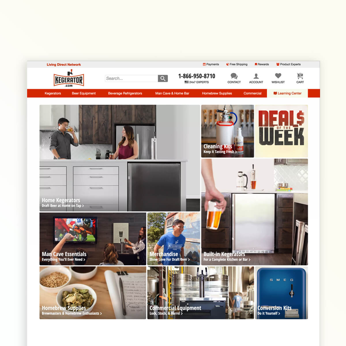
Adding value to an e-commerce shopping experience starts with good user-experiences and good user-experiences start with a site that works by being easy-to-use and focused on customer goals. This builds experiences that add value and services for the customer experience.
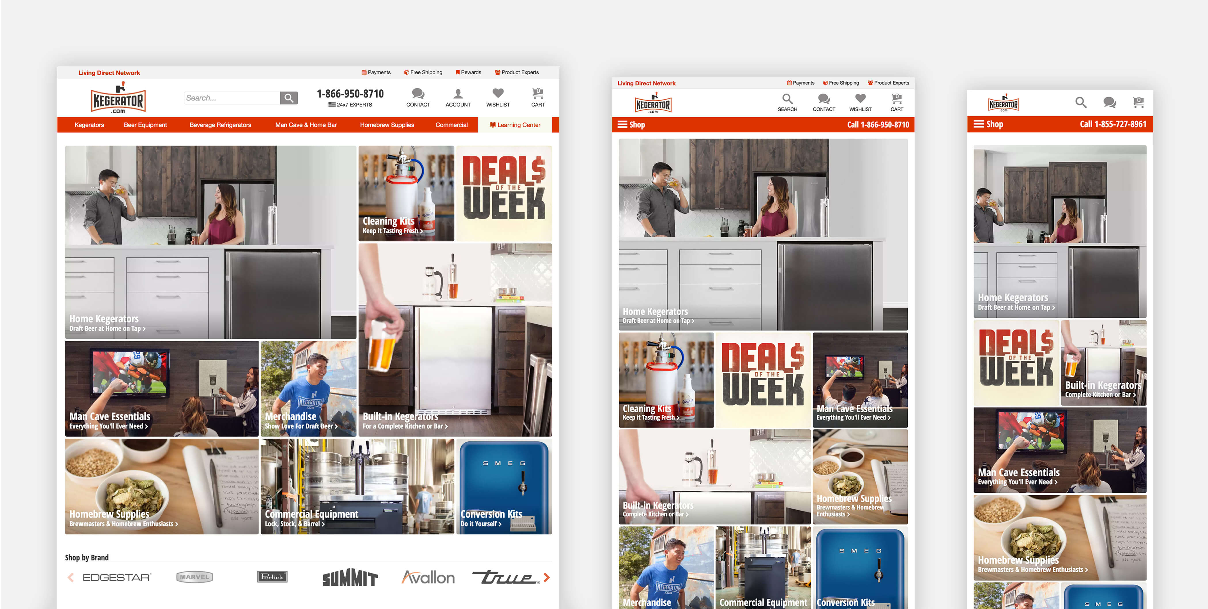
Responsive Web Design
In designing and optimizing for responsive web design and mobile-first there must be continuity in content and functionality across devices. Responsive web delivers the best user experience for each device and constraint, making it easy-to-use and accessible to the user at every interaction.
Adapting to the mobile-first principle primed kegerator.com for when mobile traffic hit a tipping point, successfully increasing the conversion rate by 40% and mobile by 200% from the previous year.
— Director of UX and Analytics
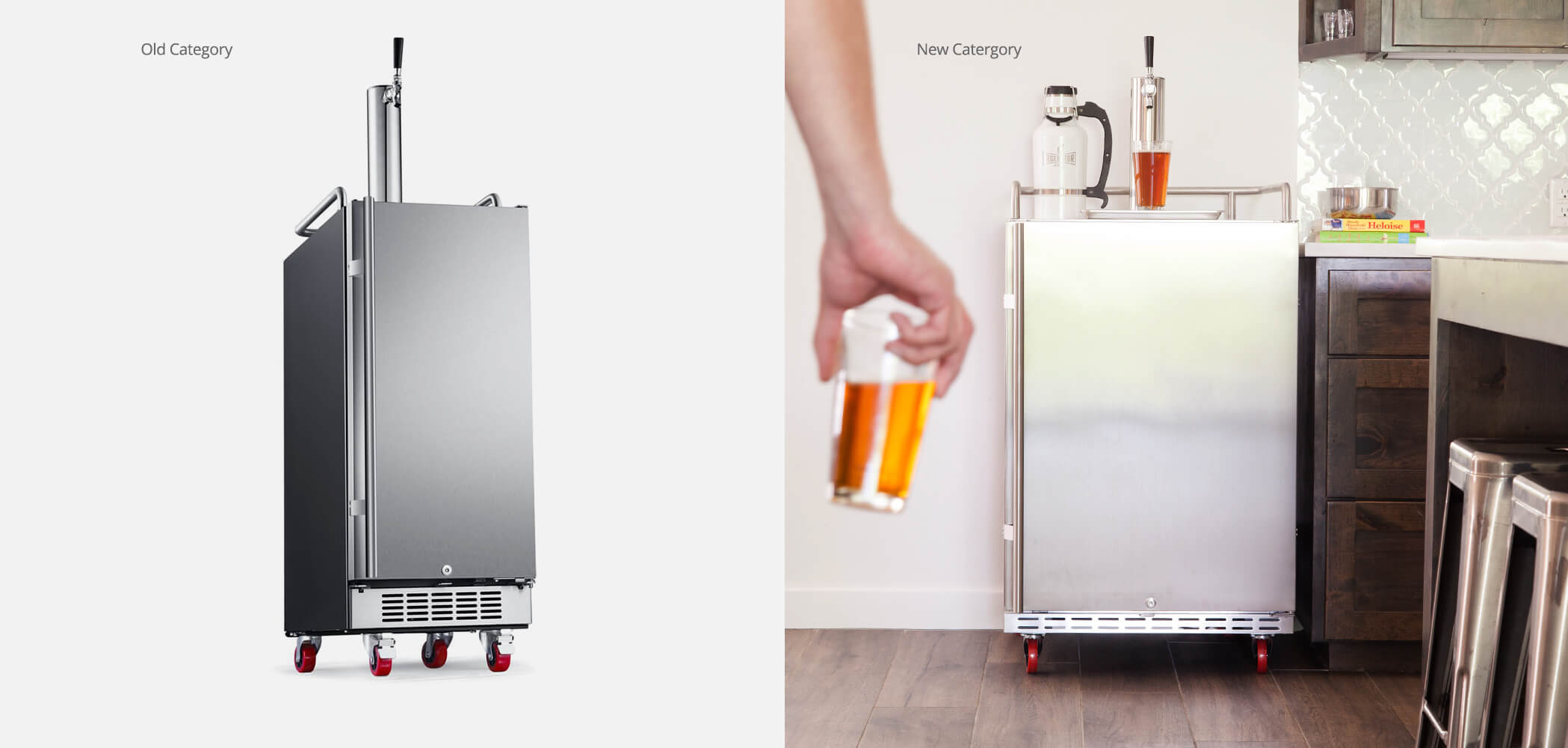
Lifestyle Images
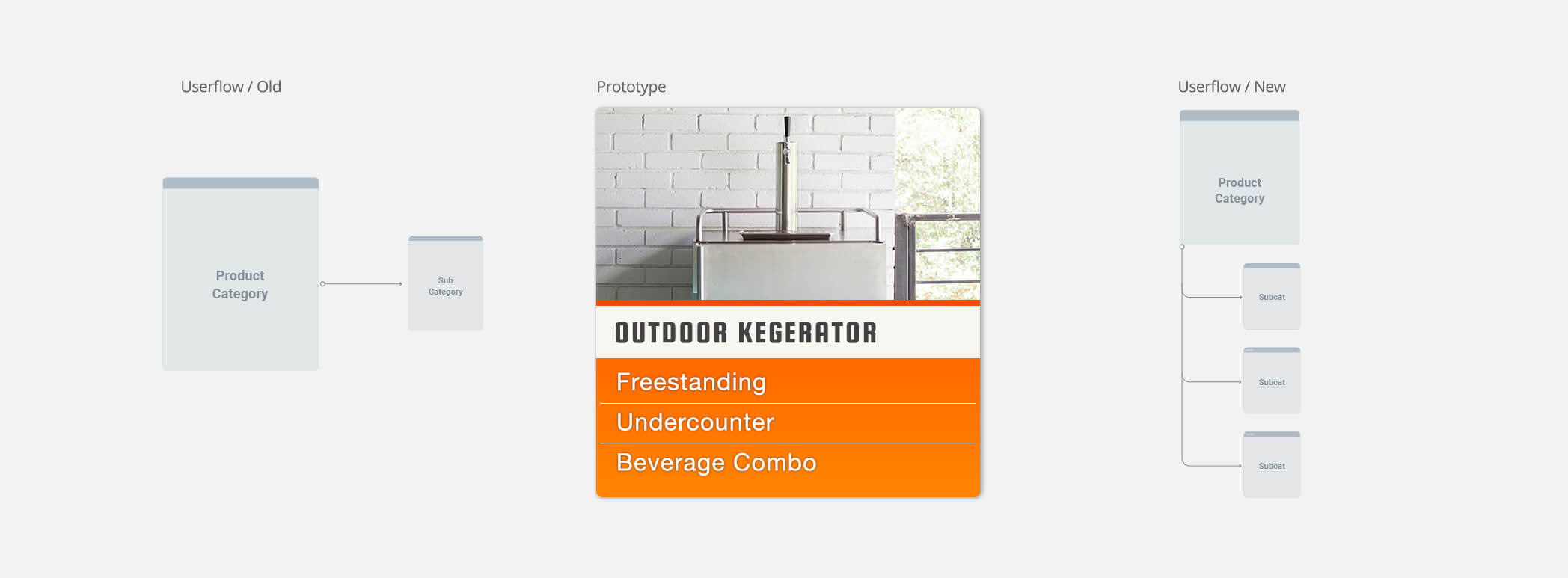
From a user experience perspective images provide a lot of information and tell a story. The “old” category image didn’t have much context which can lead to decision fatigue. The new lifestyle image adds valuable information, such as scale, context and a story.
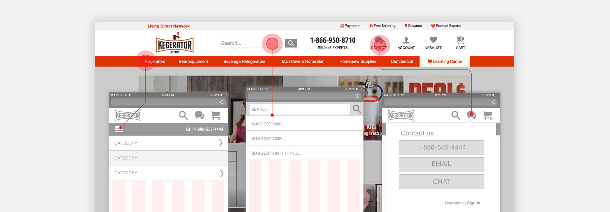
The prototype below demos how UI/UX design can change the user-flow by arranging products based on popular groupings and search terms not business categorization. This helps flatten category organization around the user needs while reducing extra page load.
Product Page Design
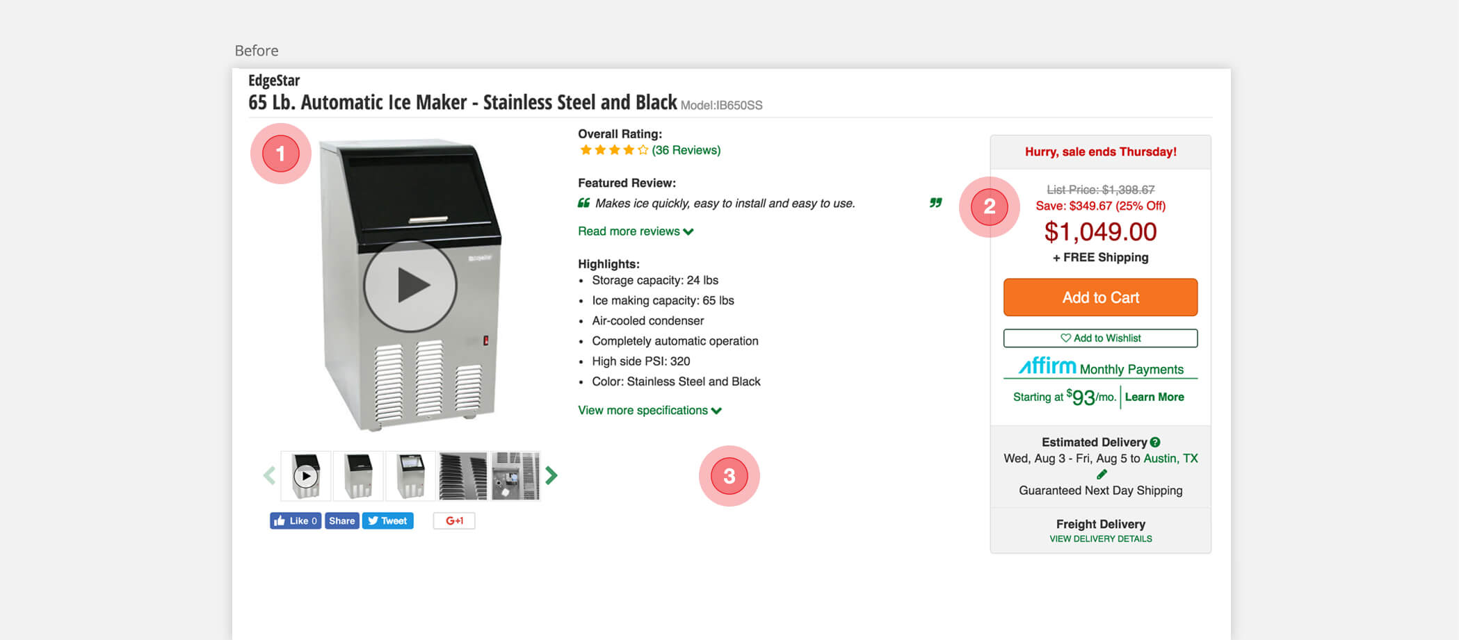
A critical part in the conversion funnel in e-commerce design is the product description. A lot of consideration went into the new re-design. What color CTA, were to designate value props, how many reviews, when or when not to tell the discount story. The following image before the re-design shows in “dot 2” a price block over-complicated by business goals.
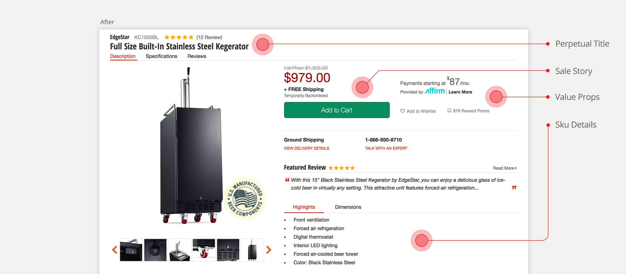
After gaining insight from user-testing, then A/B testing new prototypes. We began to see the significant change in higher average order values when the sale story was simplified. The ratings and reviews section won confidence on new users. The new design established a clear visual hierarchy for future designs and performed better on mobile testing.
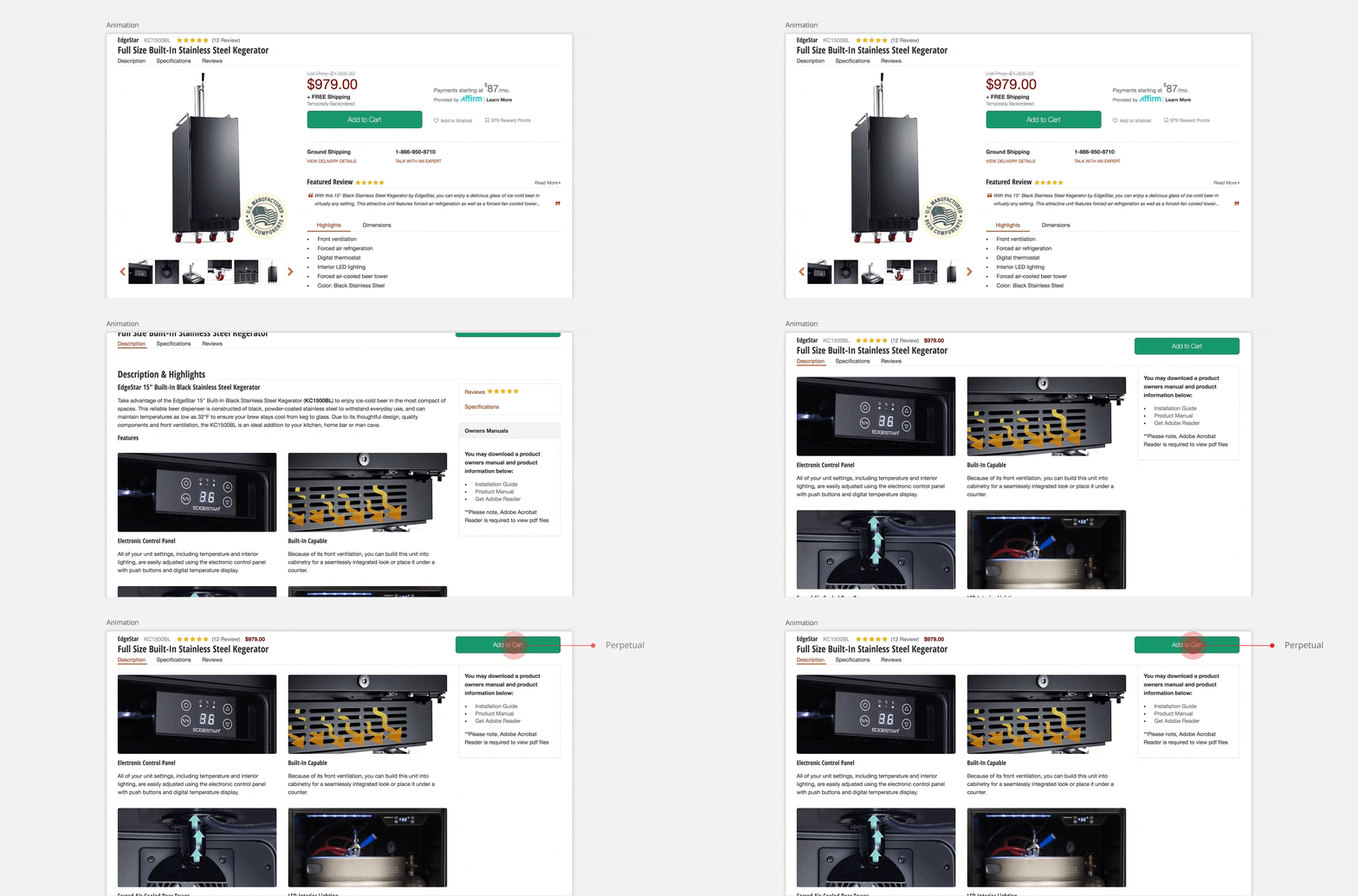
Animation below shows how a new design pattern can enhance the user’s experience. The trend is longer and longer one page web designs, above-the-fold is still prime space but you are not limited. The perpetual title and navigation with CTA follows the user while scrolling keeping engagement and navigation accessible.
Conclusion
What I learned is online retail is fast-paced. Higher conversion is always the bottom line for a business but good user-experience must balance business goals with users’ needs. As Lead Designer I could not have done much without organizational support and a great team of developers, designers and category managers.
